

Zeit

Overview
Challenge
Imagine yourself in the future, in a world where time travel to the past finally exists! Zeit is a company that offers trip packages to the past (not the future, because that could interupt the time space continuum) and they need an e-commerce site to get their product into the hands of their future customers.
Who
That’s where I come in. Now that Zeit has been given standards from the International Concordance on Time Travel, they have the green light to sell trips online. Consumers will be able to purchase tickets to a total of 289 destinations all over the world- from Prehistoric times to the present day.
Why
Users interested in time travel need to have a way to learn more about the company and purchase tickets. An online e-commerce site is the perfect tool to provide users access to time travel trip packages.
My Role | UX and UI designer
Duration | 3 months
Tools | Figma, Miro, Procreate
Research Methods
Research Plan
First and foremost, I needed to put a plan together. Jumping straight into building an e-commerce site for a futuristic company that sells time travel trips to the past would have led to a very chaotic and unpleasant experience for the users.
I made sure to identify my primary research goals, methodologies, a timeline, and participants for surveys as a first step.
Competitor Research
Evaluating and understanding what works- and does not work- for the competition was vital in determining which direction to go in regarding the feel and functionality of my Zeit site.
The most comparable genre of companies and thus, websites to review are those in the travel industry. I selected several popular sites and took notes on their strengths, weaknesses, and provisional personas of users that would visit their sites.

Project Goals
I laid out the project goals in terms of potential user needs, business needs, and technical considerations. Once determined, I was then able to discern areas where the common needs overlapped, which helped me decide which features to prioritize, and which features could be saved for later.

Key Insights
I gained two key insights from user research:
Easy-Access Information - Users prefer easy access to more in-depth information. To provide this, I designed Quick View pop ups, allowing users to stay on the same page while also being able to pull up more details about individual trips and activities.
Efficient Filters - Users want an efficient way to narrow down search results based on their personal interests. Ample filtering options were provided on the Destinations page. The filtering method was informed by a Card Sorting exercise during which participants were given 20 cards total, each with varied people, places, events and eras from throughout history. Each individual sorted and categorized the cards however they saw fit. This helped me create the Information Architecture for the filters on the Destinations page.


Defining the Product
User Persona
Meet Jinni- she is a potential user of the Zeit site! In creating a user persona based off of the demographics and survey results of my participants, I was able to use Jinni as someone to build my future user and task flows off of. This helped me get into the mind of a potential user.

Task Flow
As the details began to come together, the time came to work out a task flow. Utilizing Jinni as my user, I developed a task flow starting from her landing on my Zeit site through an Adwords campaign, all the way through learning about and selecting a trip, to entering vital personal and payment details, and finally checking out and receiving her trip itinerary.

User Flow
Next, I put together a more high fidelity user flow using Miro. It shows Jinni entering the site through both her own research on time travel, and an ad on Facebook. This project helped show me potential pain-points and helped me think through how the user might best navigate the site in a way that hopefully leads to them converting and purchasing a time travel trip ticket.
Feature Roadmap
While referring back to my previous research and task and user flows, I brainstormed which features would be must-haves, nice-to-haves, surprising and delightful, and which could come later on.
This step in the process helped narrow my focus on which features would be most valuable to build out and which would contribute the most to a pleasant user experience overall.
Design
Sitemap
The sitemap served as an extremely helpful blueprint of the final site. While not all elements listed made it onto the final site, the sitemap was paramount to helping me map out the underlying structure of the site, see which pages were needed where and the start of content to include on each.

Wireframes
Its starting to look like a real, live, functional site! Going back to my background in art, I really enjoyed getting to finally build out and create the Wireframes and see all of the previous steps in the process start to come together in this visual representation.

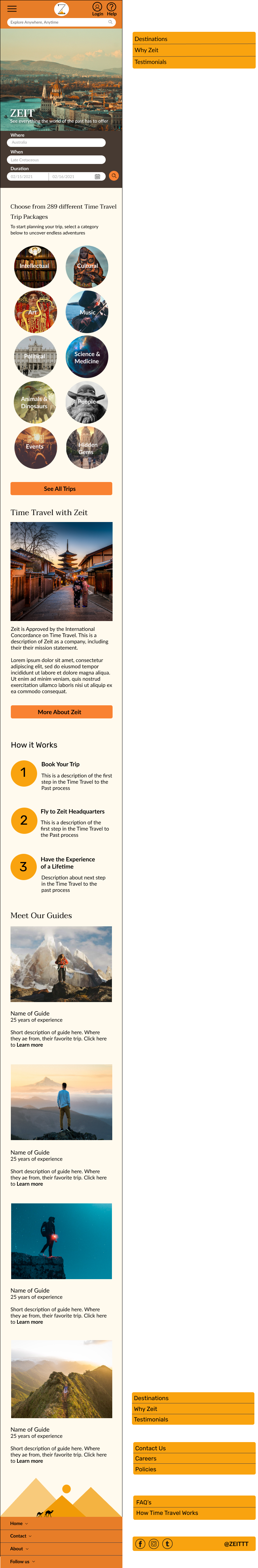
Responsive Wireframes
No matter how good a website looks on a particular screen size, it a necessity for it to appear and function properly on as many screen sizes as possible, or in other words be responsive. For this step I made the Home page responsive for desktop, tablet and mobile.

Branding
Mood Board
Creating a mood board to help me determine the overall mood and branding of the Zeit site was another step I was quite fond of. I dove into the far corners of Pinterest to find imagery, fonts, patterns and color palettes that I felt represented the Zeit brand I was going for.

Style Tile
I made a point to not create a futuristic-looking site. Since I am creating the site assuming I love in a future where time travel to the past exists- making the site look futuristic felt like a moot point to make. I decided to focus on making a site that felt warm and inviting. As if the past is opening its arms to you, ready to give a warm embrace. Going on a trip with Zeit will allow you to enjoy, celebrate, and experience all that has come before you.

Responsive UI Design
It was a very satisfying moment to see the site start to come to fruition. I applied my logo and style tile to my responsive wireframes of the home page. I wanted to ensure my CTA’s stood out enough since my ultimate goal was high conversion. I also added a personable, changing graphic to the footer to tie everything together and add some fun character.


Building the Prototype
Once I made it past the learning curve of figuring out how to build a prototype in Figma (thanks, Youtube!) I continued building out pages and created an initial semi-functional version of Zeit’s e-commerce site. It was a fun challenge with bumps along the way- fun fact: you cannot have overlays open up from other overlays-after several iterations, I ended up with a prototype that was ready to be put to the test.

Usability Planning and Testing
Using the plan and script I created earlier, I put the prototype to the test with four participants. Some common patterns I discovered included most participants enjoying the circles/bubbles as Call to Actions, confusion over the function and location of the Activity filter, and users wanting to see tags they could easily x-out when using the filters to search for trips on the Destination page.


Affinity Map
In order to tame the chaos that is data collected from user research, I developed an Affinity Map. This helped me really see the patterns by using color coding to show me how many users had similar concerns or comments about individual features.
Priority Revisions
Back to the drawing board! I made several iterations to my existing prototype based on the user research results. These iterations included the following:
Moved the Activity filter from the Destination page to the trip details page. This allows users to more easily find and add activities to their trips.
Added removable tags to the filters
Adjusted the Quick View button placement for the activities and ensured the elements and buttons were properly aligned.

Take Aways and Next Steps
The part of the process I enjoyed most was developing the overall style and branding of the site. Moving forward, I would love to further refine these to ensure they are as user-friendly as possible. I learned how important and valuable the feedback from user testing is in providing the best possible experience. On future projects I will devote more time to developing more open ended interview questions in order to keep the conversations and feedback flowing.
As a next step, I would continue refining and adding small details to build up the tone and character of the site. For example, varied silhouettes on the footer. I would also continue to improve the features based on further user testing. I also feel that changing the color scheme to cooler tones would be beneficial as they would build more trust between the company and user.